My package of free samples got lost by usps and Sola team came together and ended up shipping me a new box of samples that I need for my wedding for free! They also answer back fast to emails.

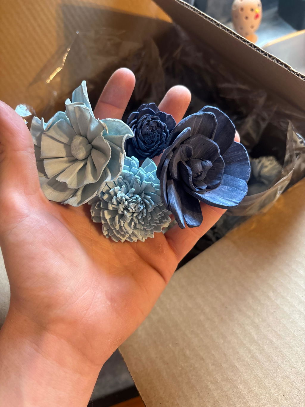
I chose the aqua, teal, mud mask, and raw. The colors are exactly what I am looking for for my wedding and plan on buying bouquets
Love love love! The color is PERFECT for my wedding I can’t wait to make all of our stuff I’m super excited! The flowers are perfect!
I wanted to order the Sola Wood Flowers for center pieces at my daughter’s wedding reception, but wasn’t sure which colors would be the right match. Seeing them “in person” really helped me to make my decision to place an order!
The flowers are beautiful colors. We got Blue Spruce, Marigold, Jasmine and Blush Pink. We were looking for a teal and the blue spruce is actually a beautiful deep teal. The Marigold is just the right touch of yellow and gold to be warm and beautiful and the Blush Pink is a nice dusty rose type of color. The feel of the flowers is soft but firm to last. Can't wait to order for the wedding.
Really beautiful flowers and colors. Love them
Flowers came out exactly like the picture and look amazing, great quality! Arrived assembled just at pictured.

What a great find, I will definitely use this vendor and beautiful product for future events and weddings.
Didn't really know what to expect with the sample but once received it helped me make up my mind about wanting these flowers for my wedding. Can't wait for the real order to arrive.
When I received the sample of these flowers, I was amazed! They feel like real flowers. The colors are bright, and the shapes are so realistic. I can't wait to see what my bouquet looks like.
Im getting married next year and was looking at different flower bouquets and I know for real flowers they can be thousands of dollars. I was just scrolling on Facebook one day and came across sola wood flowers and figured id check them out! They were offering a free sample of the flowers so I ordered the samples and omg! I couldn't believe how real they looked and felt! Also much cheaper than real flowers plus you can keep these as a keepsake unlike real flowers that just welt after a few days. Im definitely going with sola flowers for my big day!
I received my sample order and they are better than I expected. The quality is great and the colors are wonderful. I am very happy with them and can't wait to place my full wedding party order.
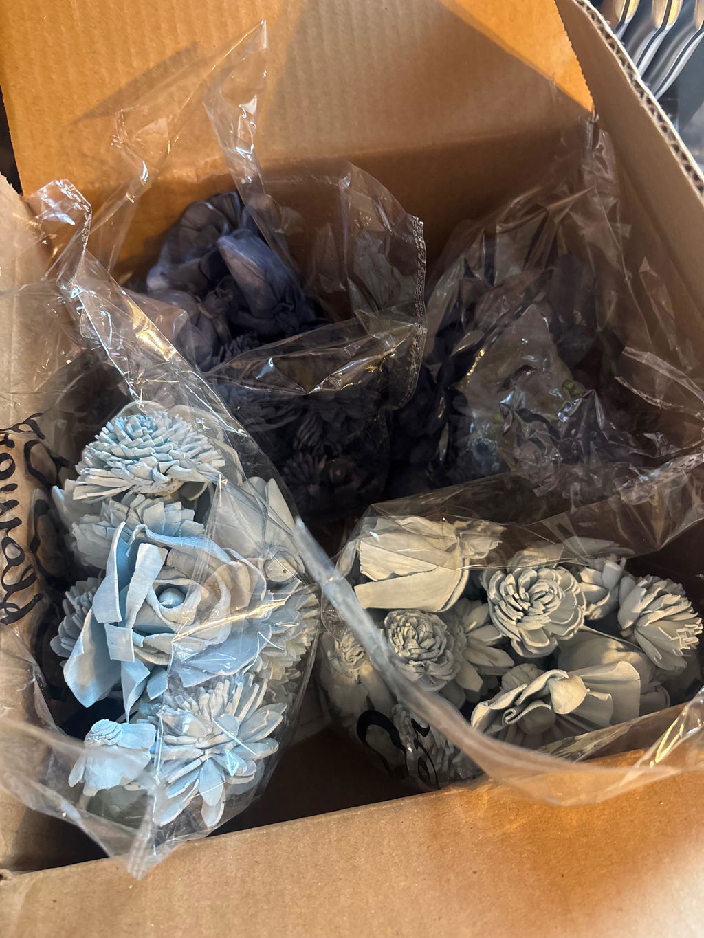
I got these to put with our center pieces and they turned out great! They are so soft and the colors are exactly what I wanted. I did not get them scented and my fiancée says they “smell like Hobby Lobby.” The smell does not bother me, I love Hobby Lobby. There’s no bleeding with the colors or anything and all the flowers showed up in really good condition. There were a couple damaged, so I wish the packing was a little better. But overall I’m very pleased and I will recommend these to everyone!

I received my order for these flowers and I love thrown!! Fast service in the shipping time. Thank you!! I will be back!!!

The free gift that came with my purchase was a surprise batch of greenery. I happened to get 3 small packages of red eucalyptus. LOVE THEM! Can't wait until the flowers arrive!
Beautiful. I will be ordering several more most likely. Do you offer any discount?

My husband and I are renewing our vows to celebrate our 25th anniversary. I'm extremely allergic to real flowers, but wanted a bouquet of flowers for this special day. The samples were beautiful and we couldn't believe they were made from wood. They felt so real! We immediately placed an order the same day.
The flowers are so soft. I love the color options available and am looking forward to placing an order.

Flowers look amazing for bridal bouquet
With all white flowers and many white color options, the sampler was a huge help to decide what shade of white to go with. Beautiful flowers and colors, can't wait to get our order in!
I really like the texture of the flowers and how realistic they look! I’m considering using these for my wedding! If not for my bouquet then definitely for their decorative flowers!
I was skeptical at first but the sampler is the best option to test out the colors and see them in person. They feel like real flowers and are amazing!

